Color influences everything—from how we decorate our homes to how we express ourselves through art, fashion, and design. A thoughtfully chosen color palette can bring harmony, evoke emotions, and tell a story without saying a word. Whether you’re redecorating a room, designing a brand, or planning a seasonal wardrobe, understanding how colors work together can make your project feel intentional and cohesive.
This guide explores how to build and use a color palette effectively across different aspects of life—helping you bring more beauty, balance, and creativity into your world.
1. Understanding the Basics of a Color Palette

A color palette is a collection of hues that work well together to create a unified visual effect. It usually includes primary, secondary, and accent colors that complement each other.
There are several types of color palettes:
-
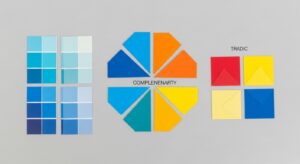
Monochromatic: Uses one color in various shades and tints for a clean, calming look.
-
Analogous: Combines colors next to each other on the color wheel, like blue, teal, and green, creating harmony.
-
Complementary: Uses colors opposite each other on the wheel (e.g., blue and orange) for strong contrast.
-
Triadic: Uses three evenly spaced colors (e.g., red, yellow, blue) for a vibrant, balanced look.
Understanding these structures helps you make informed choices that bring depth and intention to your designs or spaces.
2. Choosing the Right Color Palette for Your Home

Your home’s color palette sets the mood of each room. Start by deciding the feeling you want to evoke—calm, cozy, elegant, or bold.
-
Warm tones (reds, oranges, yellows) make a room feel welcoming and energetic.
-
Cool tones (blues, greens, purples) promote relaxation and peace.
-
Neutral tones (beige, gray, white) offer versatility and sophistication.
For a cohesive home, choose one main color palette and vary its intensity from room to room. For example, soft beige walls in the living room, muted blue in the bedroom, and a pop of terracotta in the kitchen can create a seamless yet dynamic flow.
3. Building a Color Palette for Your Wardrobe

Fashion is one of the most personal ways to express color. Creating a color palette for your wardrobe helps you simplify outfit choices while keeping everything coordinated.
Start with a few base colors (like black, white, navy, or taupe), add accent colors (like olive, blush, or mustard), and include statement colors that reflect your personality (like emerald, coral, or burgundy).
This strategy helps you mix and match effortlessly and ensures your wardrobe feels cohesive and stylish year-round.
4. Creating a Brand or Digital Design Color Palette

For businesses, a color palette is an essential part of branding—it shapes how people perceive your identity.
-
Blue conveys trust and professionalism.
-
Green represents growth and nature.
-
Red signals energy and passion.
-
Yellow evokes warmth and optimism.
Use design tools like Adobe Color or Coolors to experiment with combinations that match your brand’s message. A consistent palette across your website, social media, and packaging helps build recognition and trust.
5. Seasonal Color Palettes for Creative Inspiration

Colors can shift with the seasons, offering endless inspiration:
-
Spring: Soft pastels like mint, lilac, and blush.
-
Summer: Vibrant hues such as coral, turquoise, and sunny yellow.
-
Autumn: Earthy shades like rust, mustard, and forest green.
-
Winter: Cool tones like navy, silver, and deep burgundy.
Using seasonal color palettes in your art, photography, or home decor keeps your work fresh and connected to nature’s rhythm.
6. How to Create a Custom Color Palette

If you want to build your own color palette, start by finding inspiration:
-
Nature scenes like forests, sunsets, or oceans.
-
Your favorite artwork or photograph.
-
A piece of fabric or decor you love.
Use color-picking tools online to extract key shades and experiment with combinations until you find harmony. Stick to 3–6 main colors and use them strategically—dominant, secondary, and accent tones for balance.
7. Common Mistakes to Avoid When Choosing a Color Palette

Even the most creative minds can stumble when it comes to color harmony. Avoid these common pitfalls:
-
Using too many colors: More isn’t always better—keep it cohesive.
-
Ignoring lighting: Natural and artificial light can change how colors appear.
-
Skipping contrast: A mix of light, medium, and dark tones ensures visual interest.
-
Forgetting function: A palette that looks great digitally might feel overwhelming in a room or on fabric.
Final Thoughts
A well-crafted color palette is more than a visual tool—it’s a language of emotion, personality, and connection. Whether you’re designing a cozy living room, revamping your brand, or refreshing your wardrobe, color has the power to set the tone for everything you create.
By understanding the psychology of color and experimenting with different combinations, you can transform ordinary projects into extraordinary works of harmony and beauty.